Project Overview
I led the UX team in revamping the BET Experience festival site. Features were added such as interactive heroes with call to actions, artist & event schedules, and a new ability to register or buy tickets at the artist level. We also created backlog UX items such as category landings and event detail pages for future iterations.
Project Snapshot
Notes from BETX Whiteboarding Session
Brainstorming/Requirements Gathering Session
I met with the product team to get a loose set of requirements with some rough deadlines to begin working against.
Requirements
Splash Page with Video Hero
VIP Packages and Pre-Selling the Event
Sitewide CTA for selling tickets
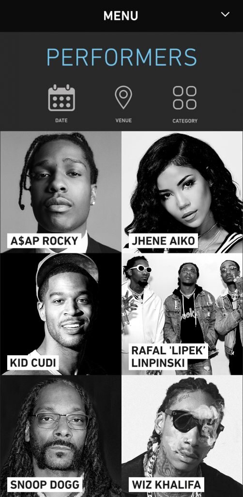
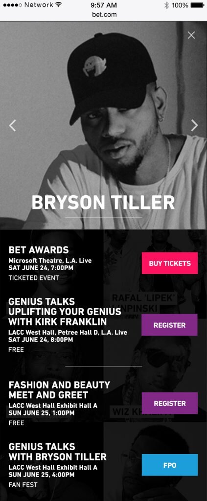
Updating Performer and Line Up Pages
Updating Event Pages
Pre-Show Templates
Introducing Users to the Artists and Events to Drive Ticket Sales
I had the UX team perform research on other festival sites to compile best practices that they could use to revamp our site. They ended up putting a strategy in place for a pre-event experience, an experience for during the even, a post-event experience. They decided to put more attention on the artist and the events. Their hypothesis was that focusing on who was performing and the events involved with the experience would be what would drive ticket sales.


VIP Early-Bird Packages
I ran user tests to figure out how to improve sales for early-bird packages. I ran tests on two layouts, one being an accordion style layout and the other being a tabbed based layout. I also performed additional research to figure out what sort of content drives sales from a user’s perspective.

Accordion Layout vs Tabbed Layout
I tested nine users on UsabilityHub and tabbed layout won with over 70% of the users tested. Their common feedback was that they liked the accordion layout better because they could view the packages at once rather than having information hidden within tabs.
Follow Up Research on Package Content
I ran additional research to figure out what sort of content that users felt was most important when they consider buying festival tickets based on the winning accordion layout.
What information would you expect to see by default in a collapsed version of the concert packages? (multi-select)
Regular price (86%)
Short descriptive blurb (86%)
Discount price (71%)
Percentage discount (57%)
Buy Now button (57%)
I ended up including the regular price, the discount price, the percentage discount, and a blurb in the collapsed view based on the results.
What would best illustrate cost savings to you: percentage discount, seeing the regular prices, or seeing both?
Discount (100%)
Percentage Discount (0%)
Regular Price (0)%
How would you go about viewing more information about a given package?
The answers were all within the realm of expectation with people mentioning tapping on the collapsed view or on the down carrot/arrow.
What additional information would you expect to see in an expanded view of a package?
Most people responded with more detail about packages or benefits, which is expected. Some people wanted to know about the number of tickets they can buy, the number of seats available, and what seats are included in the detail.
Final Wireframes Based on Research and Testing

Final BETX VIP Early Bird Packages Based on Research and Testing
Site-Wide Promotional Units
I spent time mocking up some potential layouts for how BETX content could be promoted on the BET.com main site. I came up with two potential options that could be explored and A/B tested with an additional companion sticky nav item.

Site-wide VIP Ticket Promo Options
I added requirements stating that a user should only see Option 1 once since it is a more aggressive option and would make for a poor user experience if the user would have to see it everytime they visit the website.
Main Micro-Site Landing Page Wireframes
I had the team work on a few layouts for the landing page utilizing our research. We did these layouts for pre-event sales as well.


Exploring Future Content Pages
I had the team delve into exploring future content pages that I felt would be beneficial particularly content pages around events.


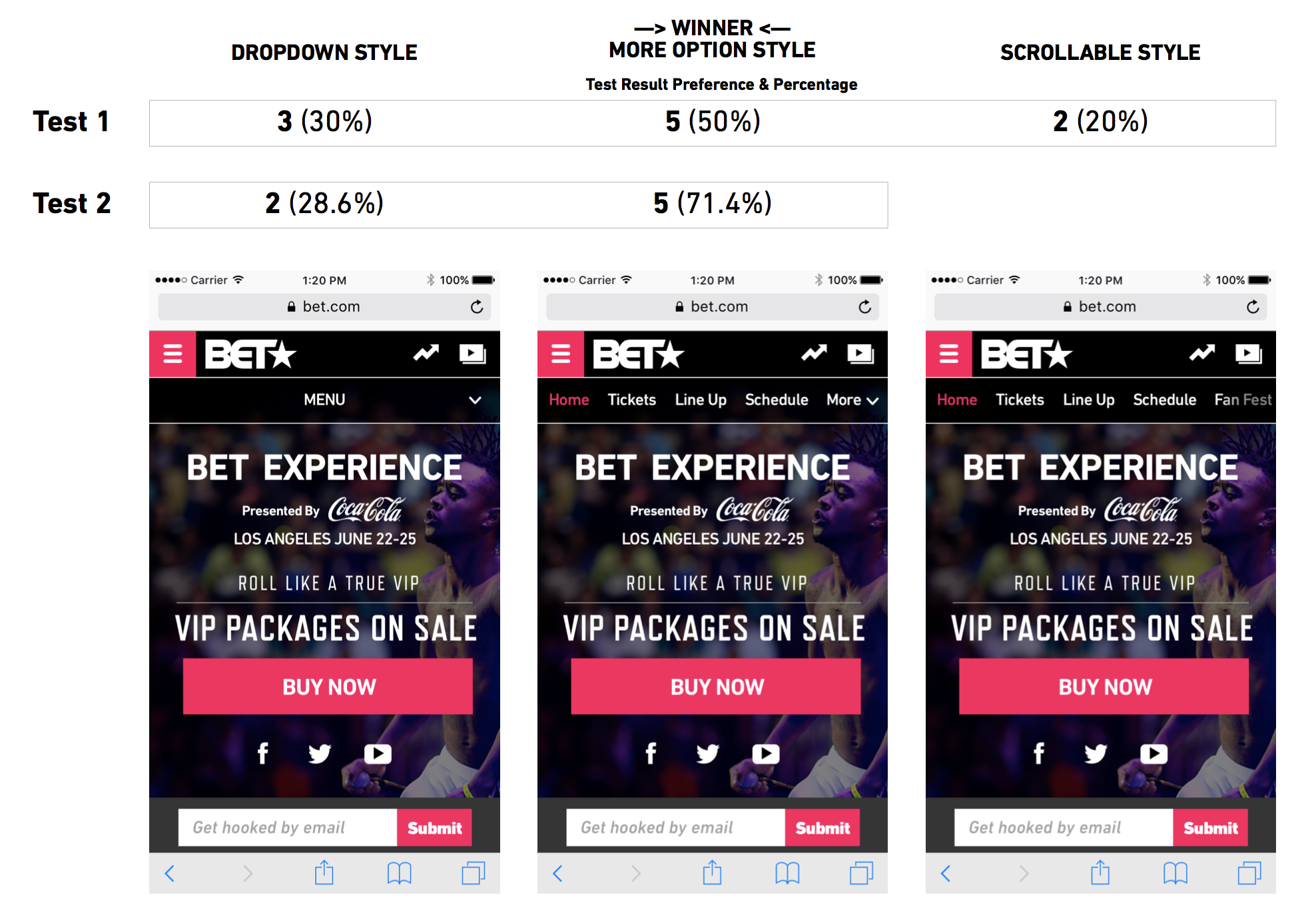
Testing Mobile Navigation Options
Working with the analytics team we noticed that there was a large divergence in traffic and analytics across mobile and desktop for similar pages. The hypothesis was that it was due to mobile navigation. Before we modified navigation all of the navigation items were buried within the hamburger menu which was confusing to a user because it would incorporate global navigation and page navigation. I had the UX team research mobile navigation items and test them to come up with a suggested improvement. They ended up coming up with three options:
A dropdown menu
A horizontal menu with a more dropdown for additional nav items
A horizontal menu with horizontal scrolling to reveal more nav items.

Mobile Navigation Options
Mobile Navigation User Test
The UX team tested ten users in the first round and seven users in the second round using UsabilityHub. I had the team run a second test on the top two winners from the first round. It was determined that the horizontal navigation with the more dropdown was the user preferred option.
Mobile Navigation User Test Results
Visual Design Comps