Redesigning photo galleries that lost their audience
After an agency-led redesign, traffic to BET's photo galleries dropped sharply. I ran a heuristic analysis, worked with analytics and ad ops to find out why, and set the strategy for a redesign that increased page views per visit by 332%.
The problem
Galleries drive ad revenue, and the numbers fell
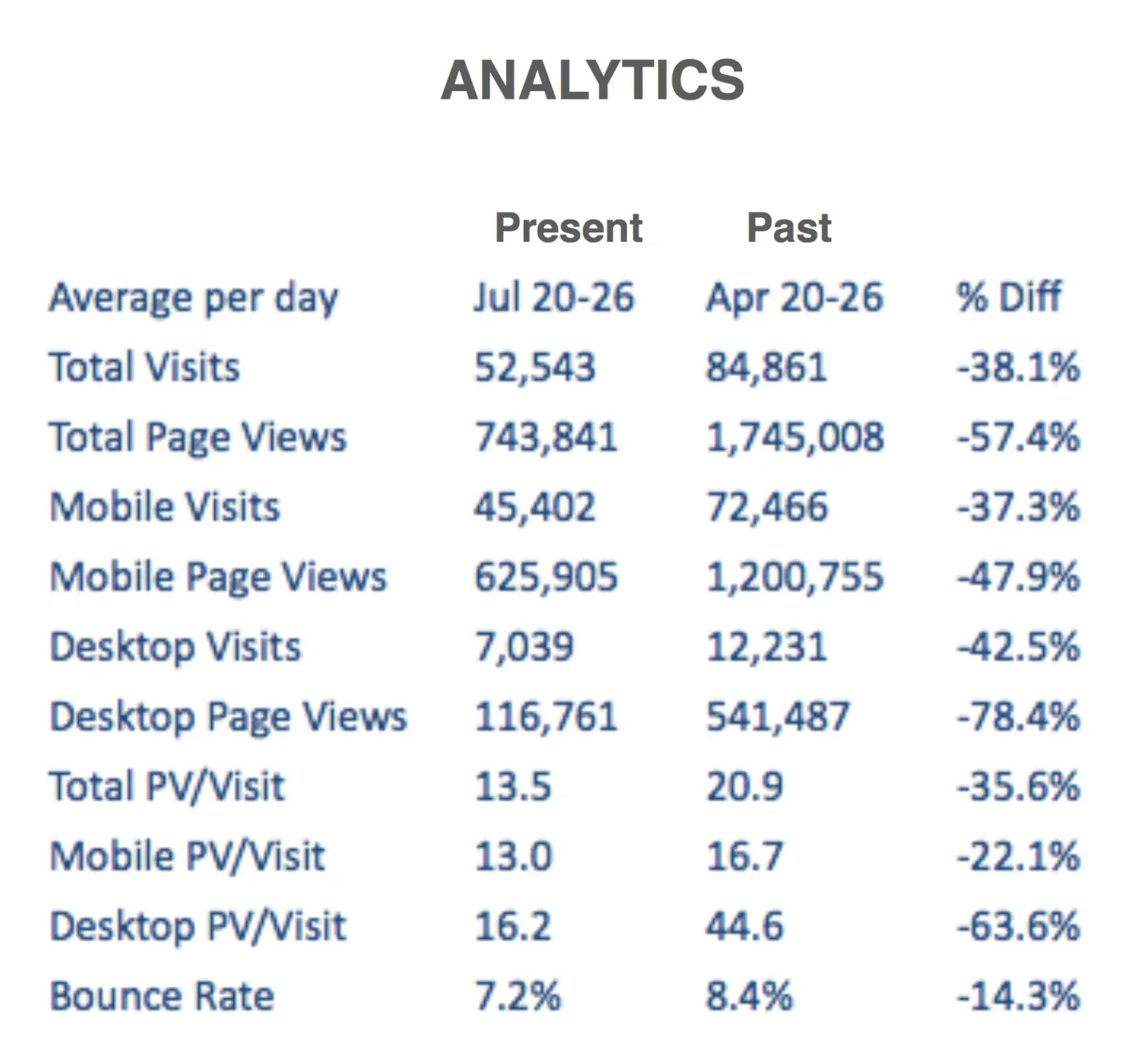
Photo galleries bring in a large share of BET's ad revenue because they're tied to BET shows and big events like the BET Awards. After a site-wide redesign by an outside agency, gallery numbers dropped across the board. The analytics team pulled the data to show how far.
- total page views compared to before the redesign
- −57%
- desktop page views
- −78%
- desktop page views per visit
- −64%
Heuristic analysis
Finding what was pushing people away
I reviewed the gallery against usability heuristics to form a theory, checked it against the analytics data, and met with ad ops to learn what they needed to prioritize.
What I found
- It popped out over a new pagePeople lost the page they came from.
- It cycled images on its ownWith no way to stop it.
- The controls were confusingPeople couldn't tell how to move around.
- Thumbnails sat outside the playerPulling attention away from the gallery.
What I suggested
- Keep people in contextEmbed the gallery in the page, or load it on top so closing it returns them where they started.
- Let people stop the auto-cyclingKeep it on for page views, but give people control.
- Move thumbnails inside the gallerySo attention stays on the images.
Strategy
A gallery and a listicle are different things
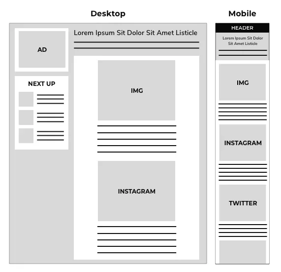
Part of the problem was that one template was doing two jobs. I defined the difference between a true image gallery and a listicle, and used personas to show the editorial team why they needed different layouts.
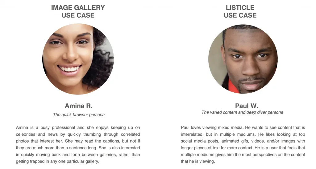
Image gallery
Images only, including social images. Short one line captions with a character limit. No limit on the number of images, so people can skim quickly. A cinematic look and feel.
Listicle
Mixed media like single images, galleries, video and social embeds. Longer text with no character limit. About 10 items, or up to 25 for featured articles. Built on the article template.
Hypothesis
How the changes should move the numbers
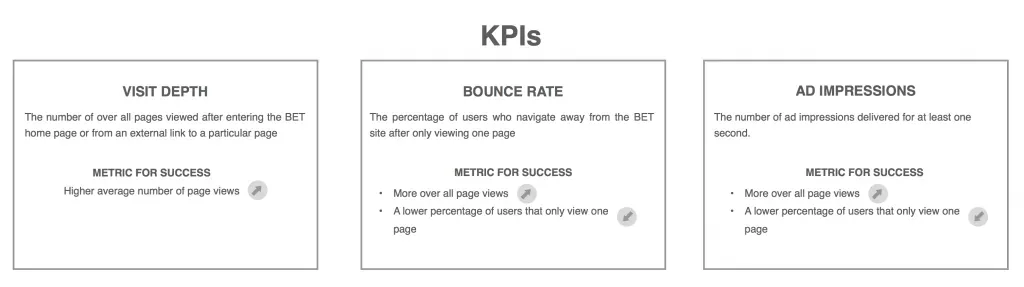
- More content leads to more page views and more ad revenue.
- A better experience, with people in control of moving between content, leads to more engagement, a lower bounce rate and deeper visits.
- Pinned, cycling ad placements create more ad opportunities without getting in the way.
- Moving straight into the next gallery or article adds cross-promotion.
The redesign
Large images on desktop, a stacked list on mobile
The UX team wireframed several options based on the hypothesis and stakeholder input. I worked closely with our visual designer to iterate on the comps.
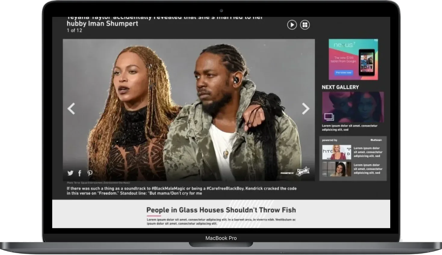
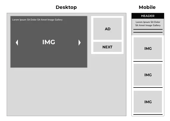
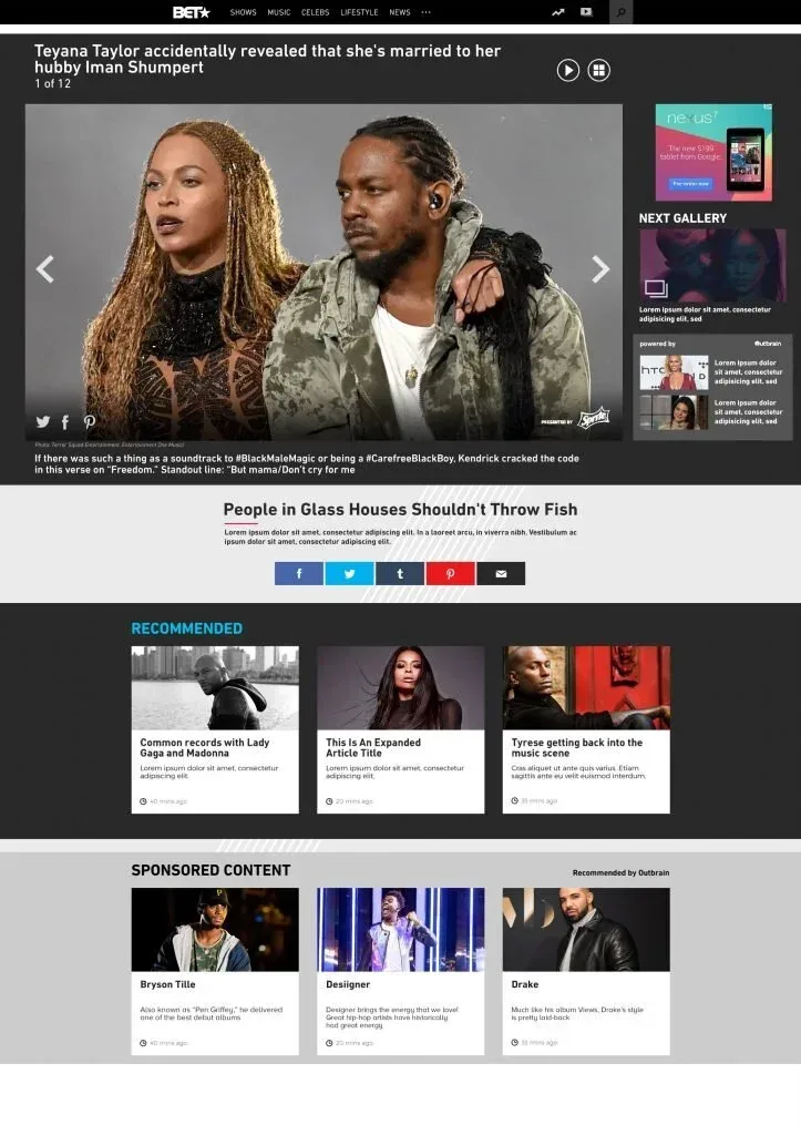
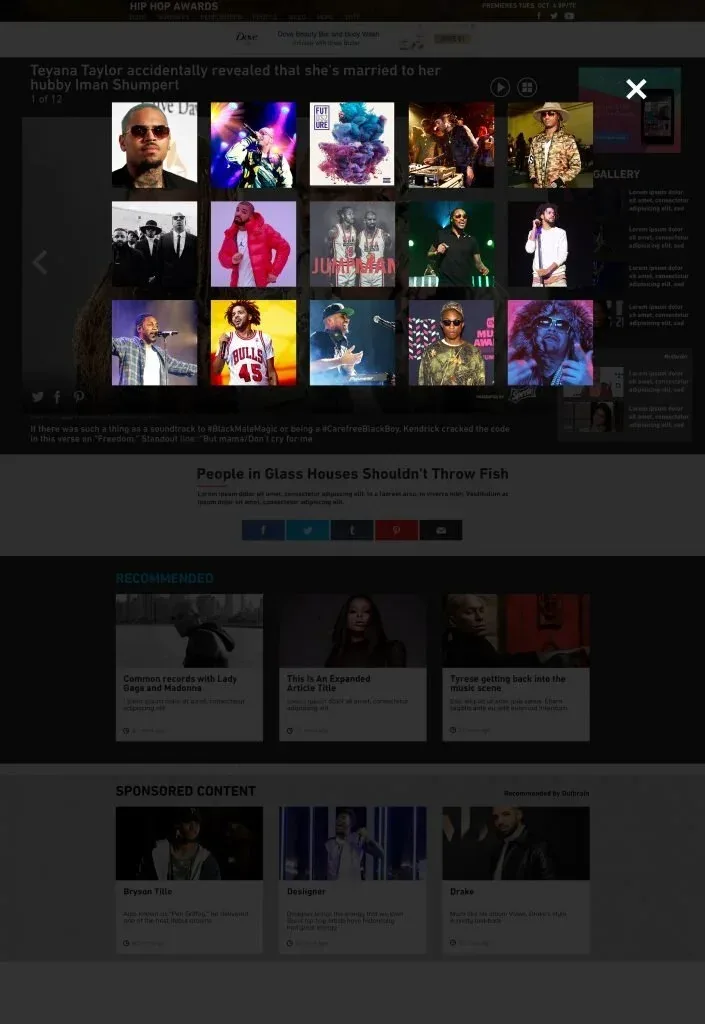
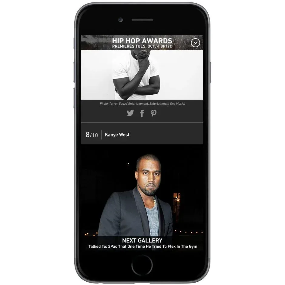
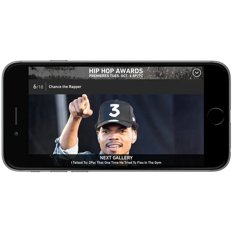
- Desktop and tablet landscape: large images with thumbnails tucked behind an icon. Images advance on their own to build page views, and people can pause them. A right rail cycles ad impressions every few seconds. When a gallery ends, the next related gallery starts.
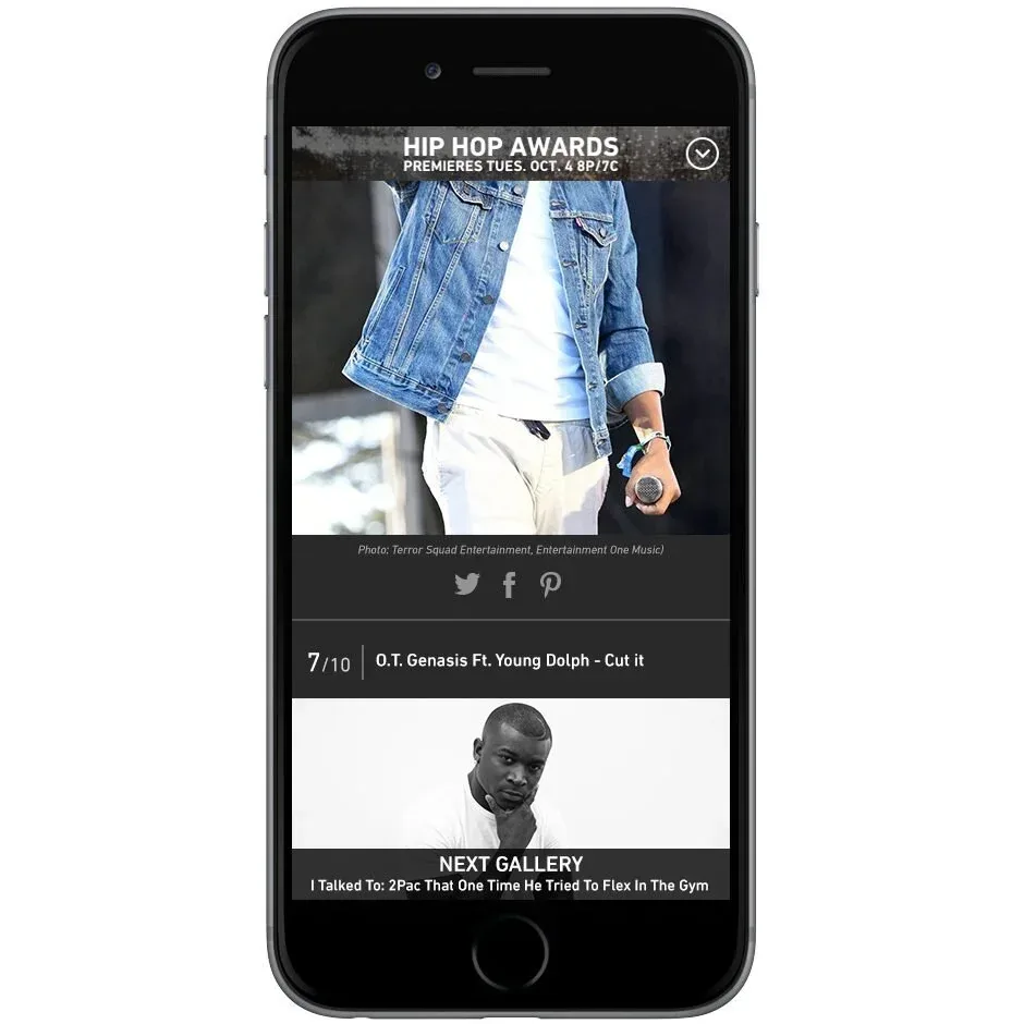
- Mobile and tablet portrait: images stacked in a list with ads every few images, flowing into the next gallery.
Result
Page views per visit up 332%
- increase in page views per visit after the redesign
- 332%
Giving people control, keeping them in context and flowing them into the next gallery brought the audience back, and with it the ad inventory the galleries were built to carry.