Handshake agreements with a reputation behind them
Oathocracy is an iOS app for making informal handshake agreements, called oaths, and tracking your reputation for keeping them. The goal was to get business agreements started faster and add a layer of accountability.
Scoping the MVP
Deciding what the first release needed
An oath is a promise with a deadline, optional proof and optional witnesses. People can make them public, revise them over time, and build a reputation from the ones they keep.
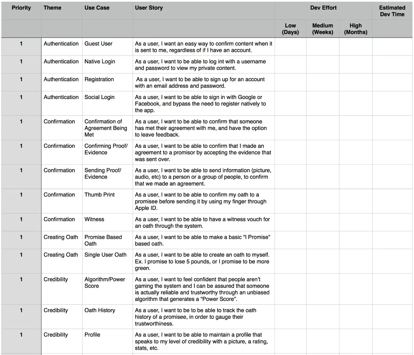
I met with the client to prioritize what an MVP needed. I put together a prioritization matrix with use cases and user stories, rated by value and effort, so we could agree on what to build first.
Site map
Turning priorities into screens
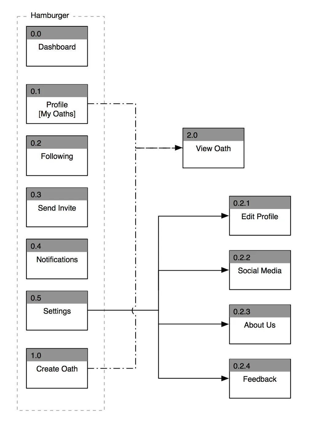
I used the matrix to build a site map, so the client could see every screen the app would need. The dashboard sits at the center, with profiles, people you follow, invitations, notifications, settings and creating an oath around it.
Oath flow
Working out how an oath gets made
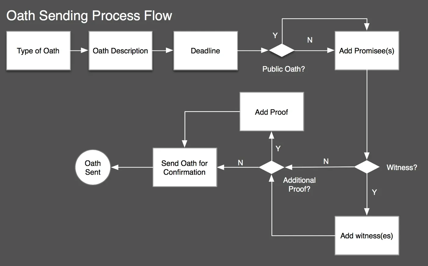
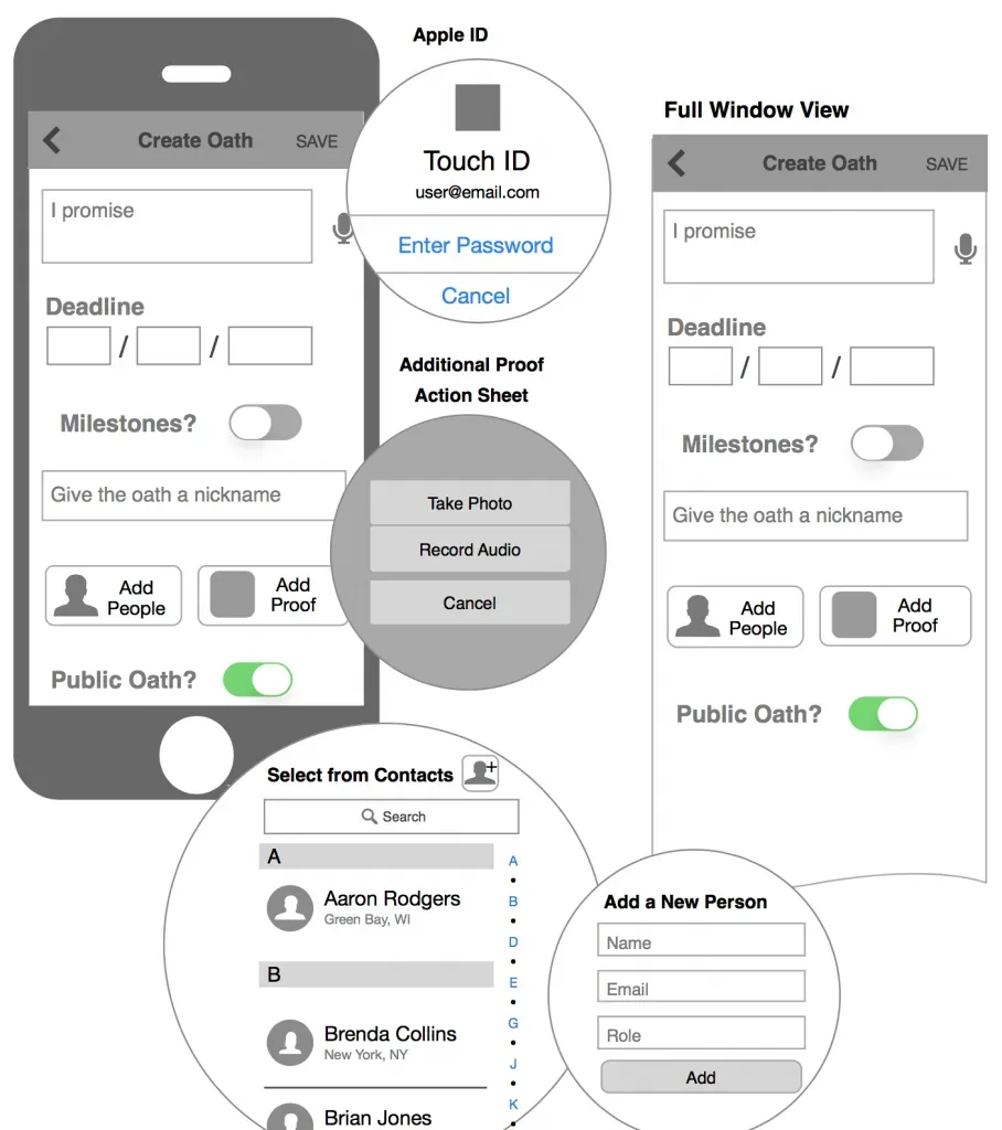
I sat down with the client and his backend engineer to map out how sending an oath would work. We sketched it together, and I cleaned it up for the documentation. The flow covers the type of oath, its description, the deadline, whether it's public, and adding promisees, proof and witnesses before it's sent for confirmation.
Wireframes
Documenting each screen
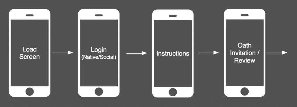
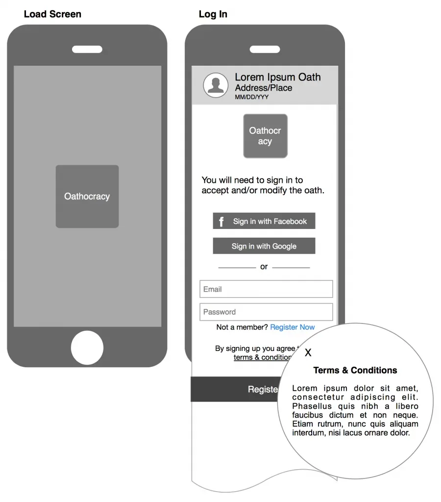
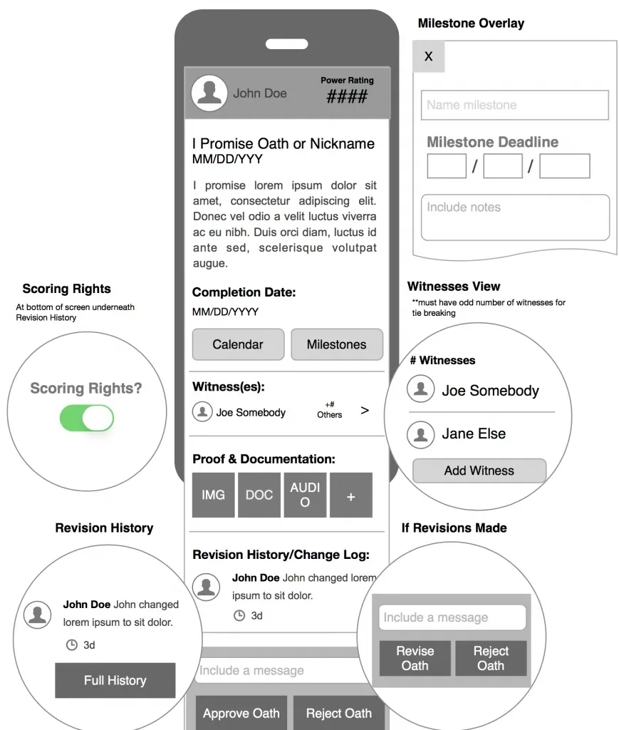
Once I had a strong understanding of what the app needed, I moved into wireframes. Each one had annotations so the visual designer and engineer knew exactly how it should behave.
Visual design
The finished screens
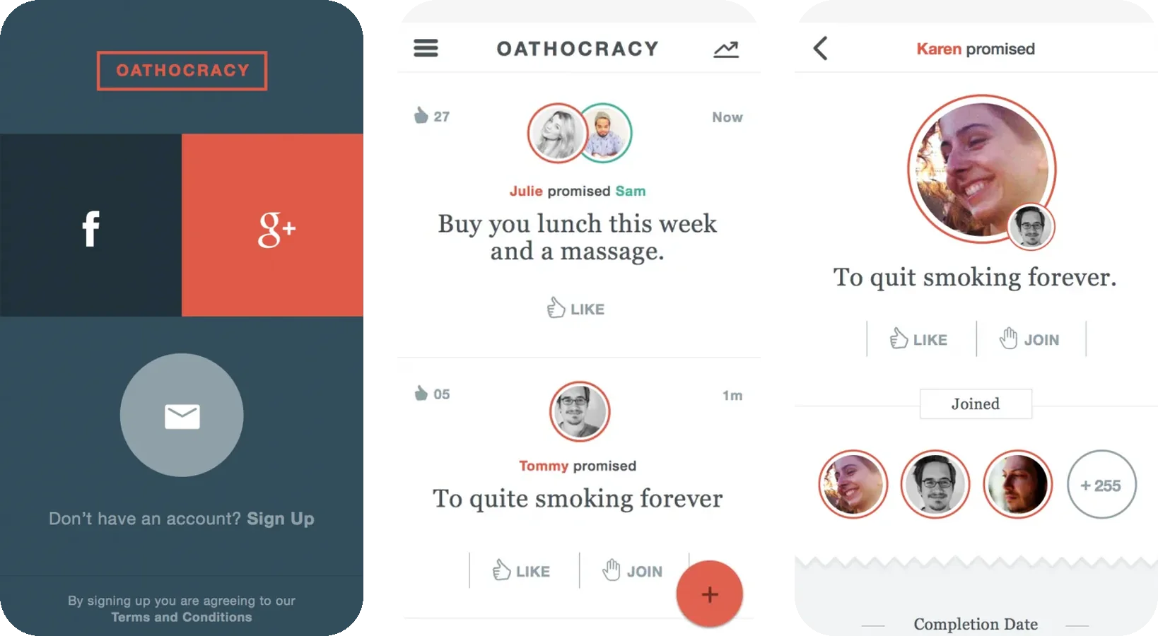
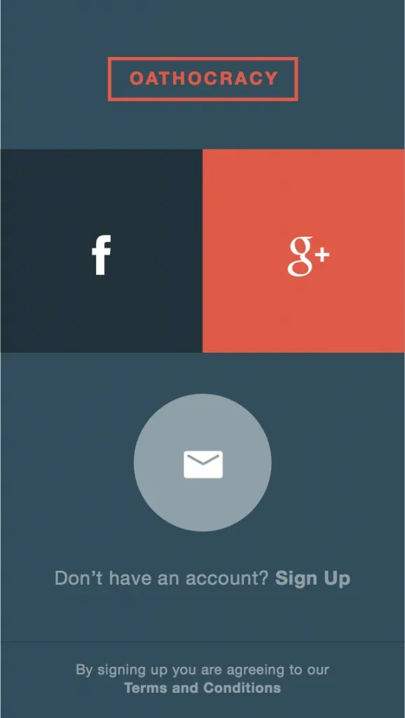
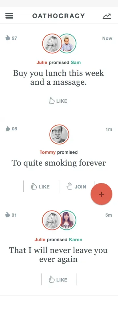
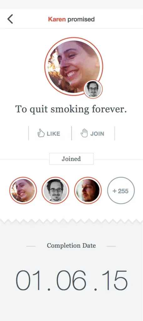
The visual designer built the comps from my wireframes, with a wax seal as the app's mark.
Redesigned for today
How I'd update it with today's mobile patterns
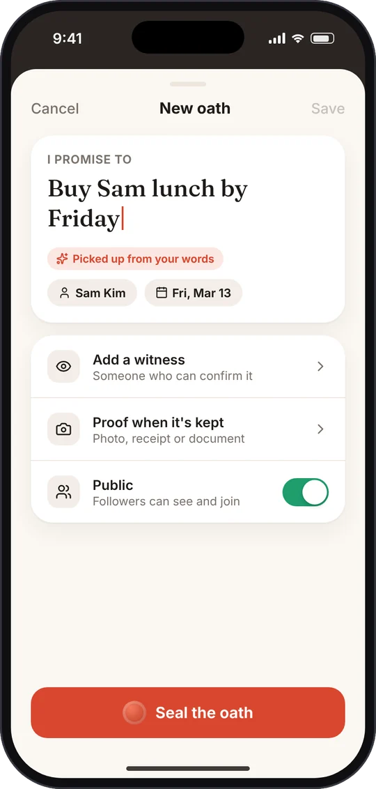
Making an oath in 2015 meant filling out a long form. This concept keeps the same idea, a promise with a deadline, witnesses and proof, and makes it feel as quick as sending a message.
- Just say the promise. Type it in plain words and AI picks up who it's for and when it's due, which you can confirm or change.
- Progressive options. Witnesses, proof and visibility sit below as simple rows instead of one long form.
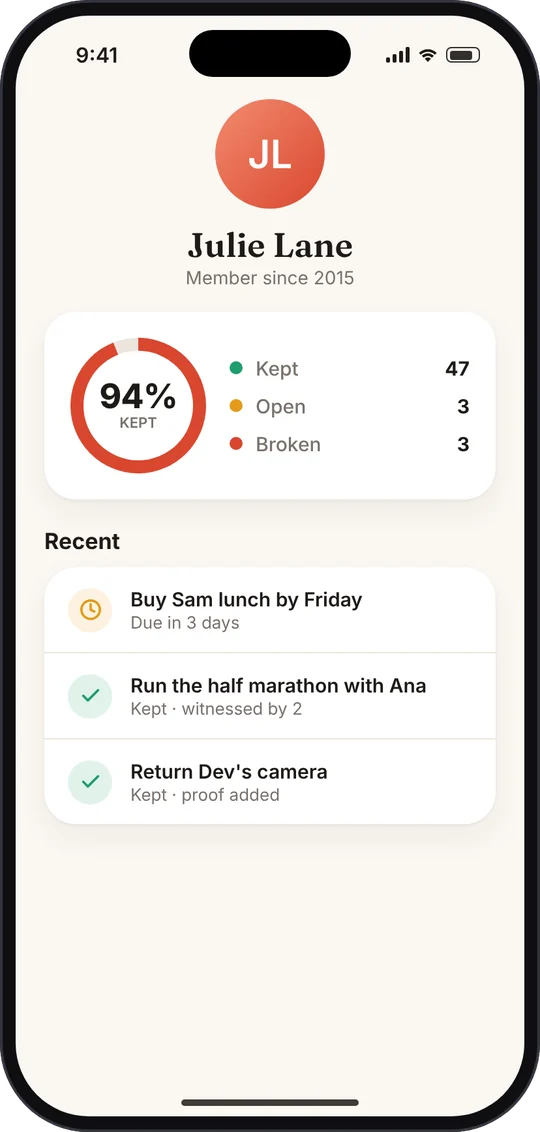
- Reputation at a glance. A kept rate with kept, open and broken counts makes accountability the center of the profile.
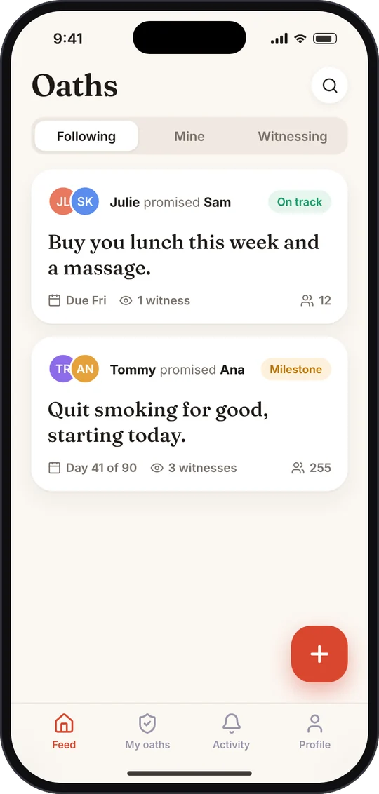
- Status you can scan. Each oath shows a clear status, the deadline and its witnesses in the feed.
- Familiar navigation. A segmented feed, a floating create button and a tab bar.