Atom Design System
We built a design system to maintain design consistency and improve our overall workflow.
Clarence giving a quick walkthrough of the design system
Project Snapshot
MVP Release:
Q4 2018
Team Members:
2 Product Designers
Background
My biggest challenge stepping into a leadership role at Kaplan Test Prep was that there were no design processes in place and limited design tools. I also quickly realized that there was a lot of design inconsistency. The solution I spearheaded was to begin creating a design system to help keep design consistency moving forward. Before the design system, designers were pulling files from Google Drive making modifications then putting the files back on Google Drive. There was no guarantee that multiple designers were not working on the same file, or did not accidentally overwrite the work of other design team members. To solve this, I negotiated a budget for Abstract to help us manage our design files in the cloud through version control.
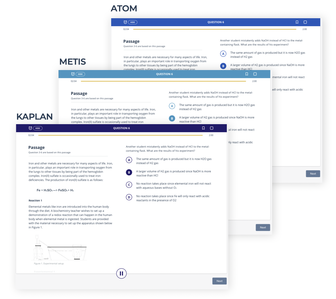
Using the Design System for Quick Theming
The design system's benefits can be viewed with the UI templates below. They are identical with the exception of the brand color swap with the header and the buttons.
Design System Benefits
Consistency with a library of components
Easily replace brand colors and styles
Increased cross-team collaboration through sharing, commenting, style guides, and code snippets
Version control and version history
Quicker turnaround for design and development
Reducing the number of color variations

Brand Colors
The brand colors we put together for Atom after performing research and testing to get a sense of what colors users attach to education. We also had a spectrum of neutral grayscale colors that will work with any set of brand colors for white label clients.


Typography
Across the platform, web-safe fonts were utilized. Titles use the Montserrat font-family while the rest of the platform's text uses Nunito Sans font-family.
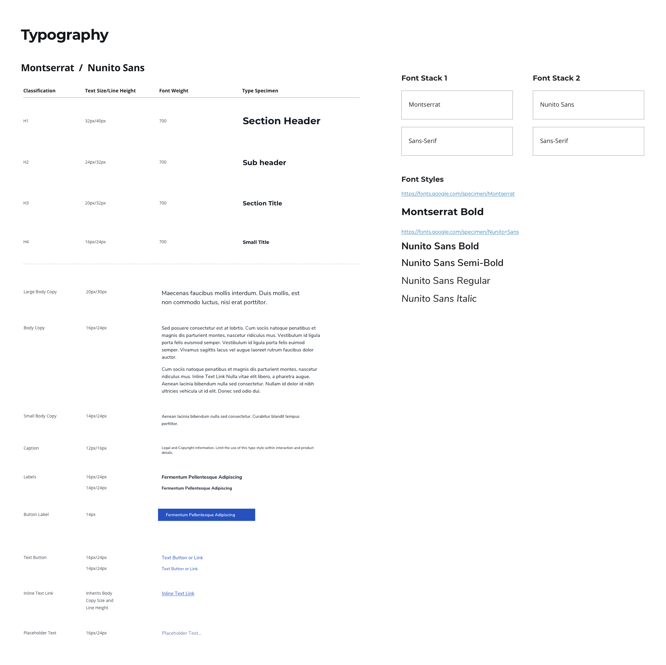
Atom Design System Typography Rules
The Grid & Spacing Components
We used an 8-pixel grid system so every bit of spacing was a factor of 8. Clarence determined that an 8-point grid would be the most effective across device types so that the grid pattern would not need to be adjusted since most screen resolutions are divisible by 8. The device determines the number of columns according to the breakpoint. Clarence put together spacing requirements within common high-level often used template structures to help with maintaining spacing consistency.


Spacing within UI Templates
Clarence put together spacing requirements within common high-level template structures to help with maintaining spacing consistency.


Navigation
Definitions for desktop top navigation, side rail navigation, and page-level navigation.

Desktop Default Navigation
Navigation with all navigation items at their default collapsed states.

Desktop Left Rail Nav Open at 2nd Level
In this state the left rail navigation is open and the user has clicked one level deep.

Page Level Navigation
Tabs are used to help users see different page-level views. We decided to go with tabs instead of infinite scroll, or paginated views because based on our research and user testing we are dealing with users from several different use cases that may prioritize different content. At times some users may be working together in a similar view based on their roles or permissions within their workflow.
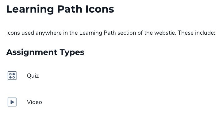
Icon Set
The custom feather style icon set that we used throughout the platform most of which Clarence designed.

Platform Icon Groupings
These icons were the most often used and were grouped into folders to easily drag and drop into the team’s Sketch design files.


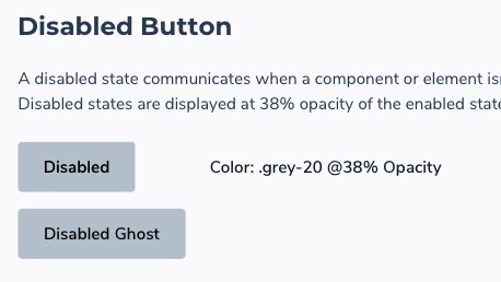
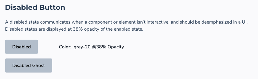
Buttons
Definitions for buttons that appear throughout the platform including size and padding.


Form Fields
Our form fields were based on the Angular material framework that our development team used for skinning UIs. Our design team used Angular as our default for form-related elements and customize the fields with our brand look and feel. There were occasions where we needed to customize an experience for instances where Angular did not work for our needs.


Tables
Due to being a PaaS platform, many of the content views use tables. Clarence spent time defining the spacing requirements for tables and creating smart tables that can be dragged and dropped into a UI, customized, and resized.


Modals
Modals were used throughout the platform for warnings or generalized messages related to interactions. Clarence defined spacing and rules for desktop and mobile resolutions.


Low-Fidelity Wireframes
After running into challenges with high-fidelity mocks in regards to counterparts seeing them as finalized solutions causing a lack of dialog and critical thinking, we decided it would be best to go with low-fidelity buffers to encourage more discussion and collaboration.


